2.3 KiB
termui
Go terminal dashboard. Inspired by blessed-contrib, but purely in Go.
Cross-platform, easy to compile, and fully-customizable.
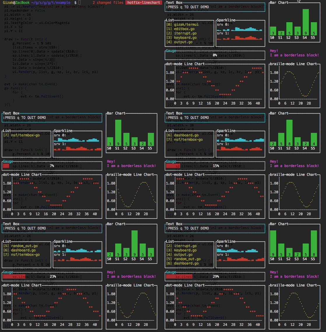
Demo:

Installation
go get github.com/gizak/termui
Usage
Each component's layout is a bit like HTML block (box model), which has border and padding.
The Border property can be chosen to hide or display (with its border label), when it comes to display, the label takes 1 padding space (i.e. in css: padding: 1;, innerHeight and innerWidth therefore shrunk by 1).
	import ui "github.com/gizak/termui" // <- ui shortcut, optional

	func main() {
		err := ui.Init()
		if err != nil {
			panic(err)
		}
		defer ui.Close()

		p := ui.NewPar(":PRESS q TO QUIT DEMO")
		p.Height = 3
		p.Width = 50
		p.TextFgColor = ui.ColorWhite
		p.Border.Label = "Text Box"
		p.Border.FgColor = ui.ColorCyan

		g := ui.NewGauge()
		g.Percent = 50
		g.Width = 50
		g.Height = 3
		g.Y = 11
		g.Border.Label = "Gauge"
		g.BarColor = ui.ColorRed
		g.Border.FgColor = ui.ColorWhite
		g.Border.LabelFgColor = ui.ColorCyan

		ui.Render(p, g)

		// event handler...
	}
Note that components can be overlapped (I'd rather call this a feature...), Render(rs ...Renderer) renders its args from left to right (i.e. each component's weight is arising from left to right).
Themes
All colors in all components can be changed at any time, while there provides some predefined color schemes:
// for now there are only two themes: default and helloworld
termui.UseTheme("helloworld")

// create components...
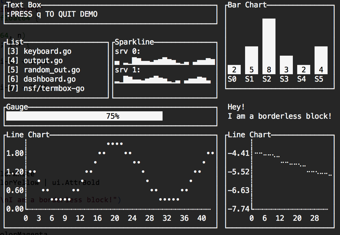
The default theme's settings depend on the user's terminal color scheme, which is saying if your terminal default font color is white and background is white, it will be like:

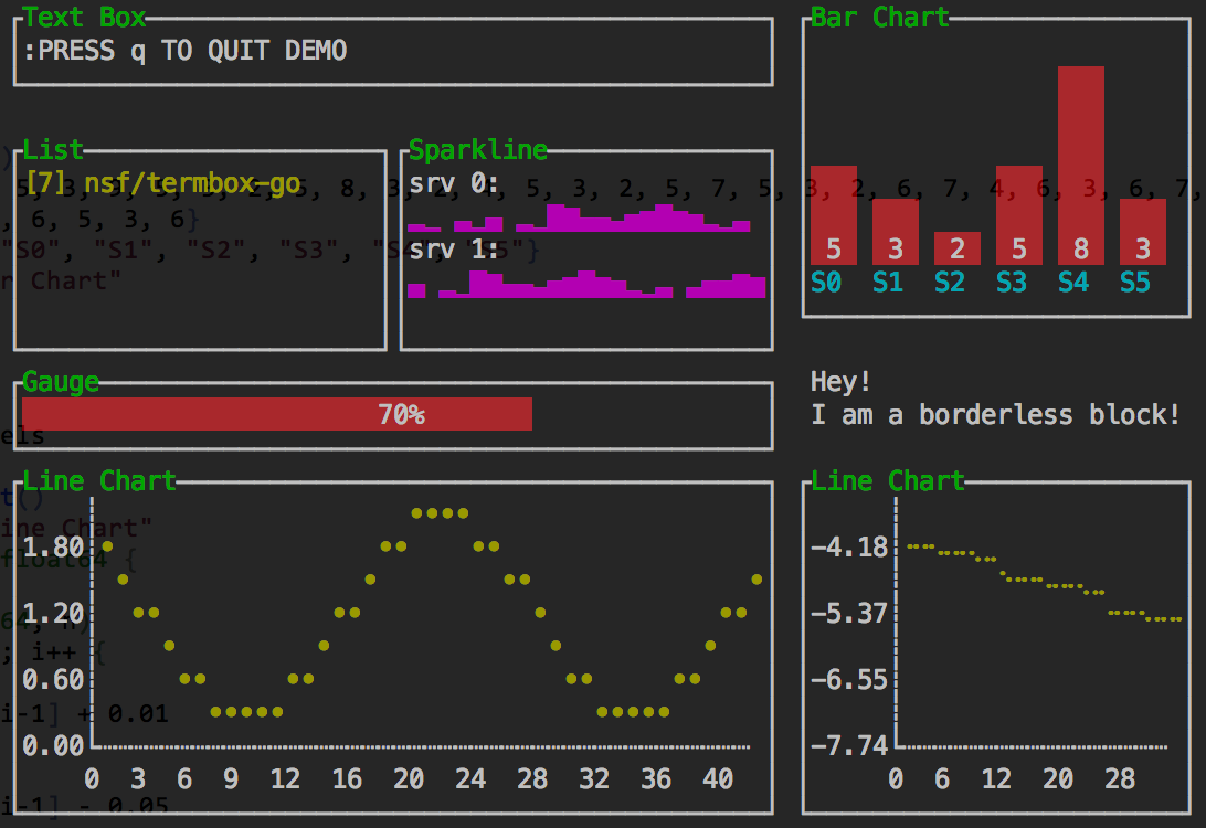
The helloworld color scheme drops in some colors!

Widgets
APIs are subject to change, docs will be added after 1 or 2 commits
GoDoc
License
This library is under the MIT License